Tero Juuti

Tapiola Games

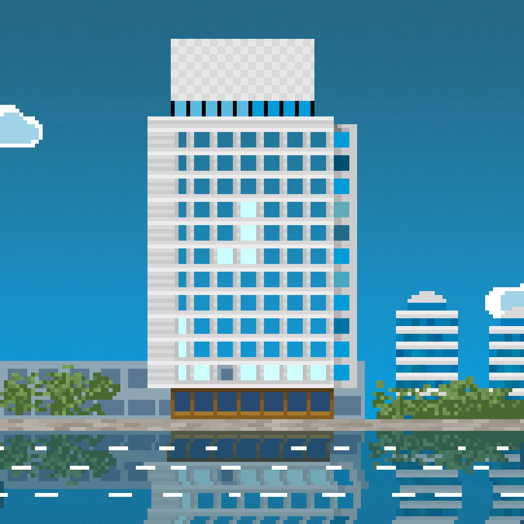
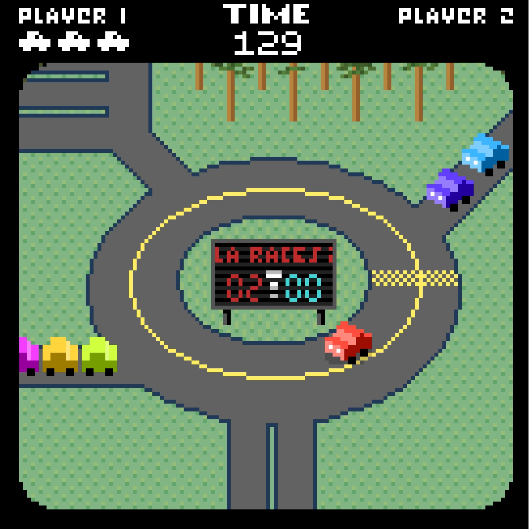
I was asked to join the Espoo New Year festival for the New Year's Eve 2024, so I made this pixel animation game trailer for a non-existing game. The game is inspired by 80s compilation sport games such as Summer Games & California Games I used to play on Commodore 64. The trailer shows three games: a racing game in Tapiola's main roundabout, tetris in the local landmark building and swimming game in the now-demolished swimming hall. The locations are also shown on a map in the trailer.

The animation was done in Photoshop (for the individual elements) and After Effects (actual animating) and projected on the wall of Tapiola Church for about a week starting on New Year's Eve.
Roxeteer Media logo

I designed a visual identity for Roxeteer Media, a web development company. The yellow color was already in use and looked nice, so the main thing to figure out was the logo. I ended up with a letter R that multiplies into several copies of itself. This represents both the web pages the company makes and the scale of expertise. And it looks quite nice. The number of R's can even vary since the outcome is still very recognizable. The animation is presented here as a GIF, but it's also possible to recreate it with code.

Espoo Visual Festival

The City of Espoo started a new festival for visual arts in 2019, and asked me to design the visual identity for it. The Espoo Visual Festival was held in mid-September in Träskända mansion and grounds. Featured artworks were mostly light art, video and installation.

The logo consists of three initials of the festival's name. Letterforms are simple and strong and the "depth" of the letter is the same as the line thickness. The letters can morph from one shape to another (below). The outlined version below is meant only for use in very light backgrounds, otherwise the letters have no outlines.

The background of the logo & other elements is a moving landscape of lines reminiscent of neon lights on a dark blue background. For still image use the designer can choose different moments from the background animation for easy variety, and for videos the motion creates a nice sense of space. The lines can also be on top of images.

A motion advertisement for the festival.
The lightbox with the logo in the festival grounds.

Focus – experimental pixel graphic exhibition

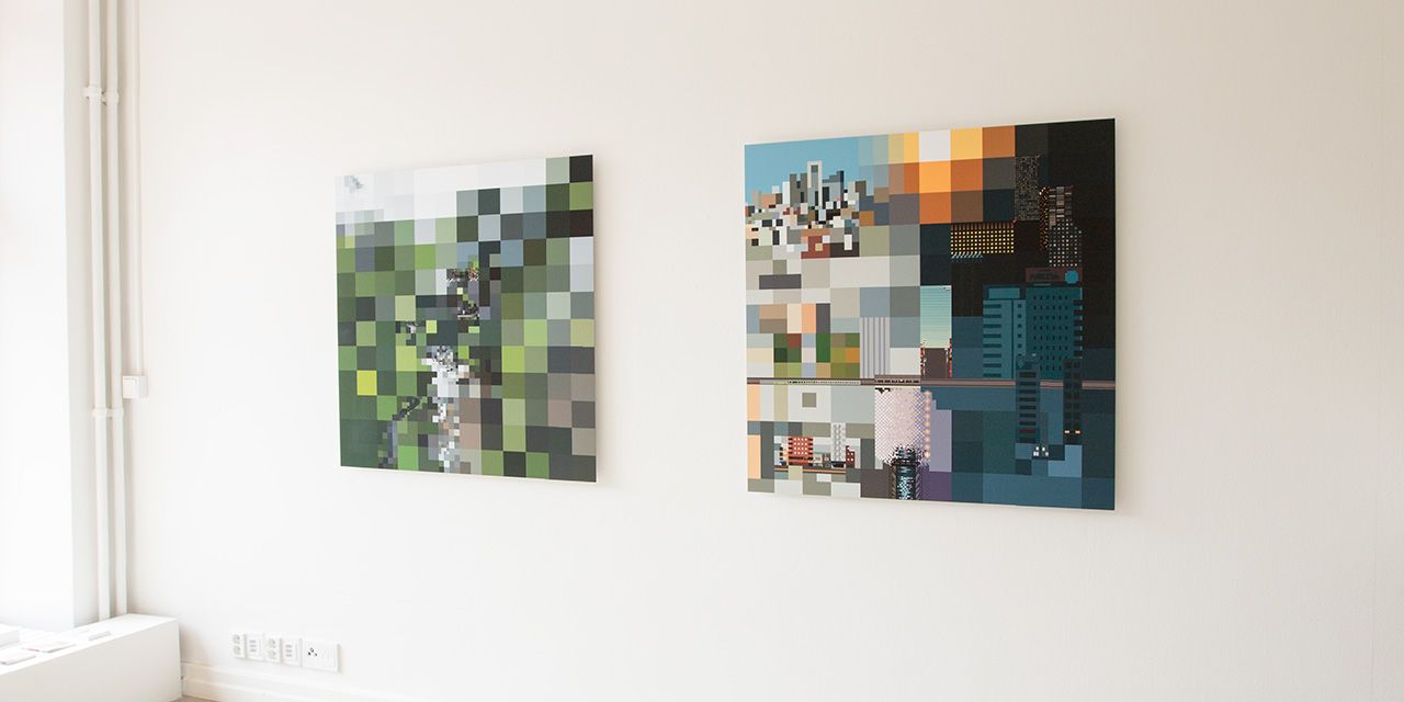
My first private exhibition was on April 2019 in Galleria Kuvitus (The Finnish Illustration Association‘s members’ gallery) in Helsinki. I wanted to experiment with varying pixel sizes (and therefore the viewing distance), so the main works were three 1 x 1 meter prints of Kallio (a neighborhood in Helsinki), Taroko National Park in Taiwan and Tokyo, Japan. The prints were started as 12 x 12 pixel images, and then continued with smaller and smaller pixel size in parts of the image, until the smallest details were just barely visible as pixels in the final prints.

Since the idea of the works was to play with the viewing distances, it’s a challenge to present them in other forms than the original prints. Video works decently, so here’s an animated version showing each work with a zoom to/from a selected detail.

The works looked like this on the gallery itself.

The fourth work is a collection of 16 pixelated images from different places, some having to do with the large prints and some unrelated. They were also arranged to a square form. The smaller works were made in a single pixel size each. Animation about the smaller works is below.

The works were a lot of fun to make and show, and the idea worked quite well, in some places even better than I had hoped. Quite many people showed up too, which is always nice. Thanks again to all the visitors!

Donna - TV Series title design

Donna is a 10-episode Finnish romantic comedy TV series starring Alina Tomnikov. I made the graphic identity for the series including title sequence and other elements.

The main character of the series is blind, so this was an important element to convey visually somehow. Of course black screen could have been a bit too minimalistic, so I thought of using hand-drawn circles as a graphic element. They look like the bokeh of camera lens (the circles light sources make when they are out of focus) and the vibration hand-drawn ones were making looked quite nice. There are some in the background in the title sequence, and another example is below.

Of course there needs to be text too, and since the hand-drawn look seemed to work on the circles I decided to use a similar approach on the texts. The hand-drawn title seems a bit light when seen in a still form but works well in motion (below) and of course when composed over images. The drawing was done frame-by-frame in Photoshop, with only the previous frame as the guide. This resulted in a small drift of the letters which is nicely lively.

I did test the actors’ names with the same technique too, but that turned out to be a bit too hectic effect when combined with images. However, I can obviously post them here as a small bonus feature.

The title sequence above is not the final one but almost, colors were fine-tuned by the post-production company. You can check out the series in Yle Areena (might only work in Finland though) and the crew & other info in IMDb.