An animated logo for Elokuvaharrastus -project (cinema as a hobby) by Koulukino. The project provides tools for making movies for young people. The logo & colors are inspired by older film titles & posters and specifically by the work of Saul Bass. Main typography is hand-made and the other part of the text is adjusted by hand and each letter individually animated.
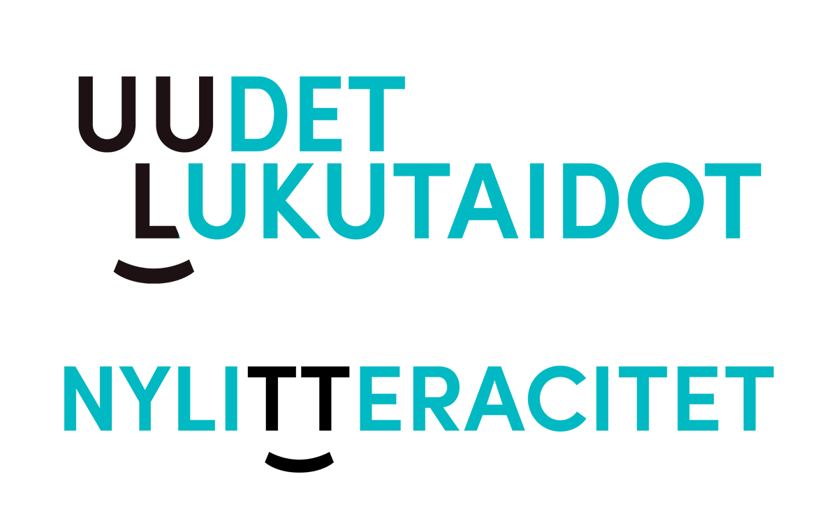
I designed a small visual identity for KAVI's (National Audiovisual Institute of Finland) development program called Uudet lukutaidot (New Literacies). Since the program was about literacy, it made sense to use a typography-based identity elements as well.
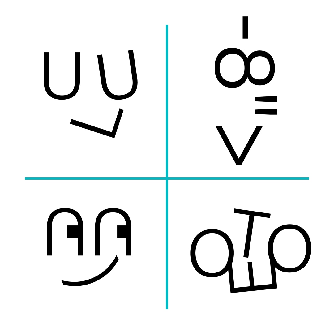
After some preliminary sketches I realized that there is a face to be found in Uudet lukutaidot -text and also the Swedish version (English version was not needed). I emphasized the face by adding a mouth (also with a typographical element, and also did an animated version.
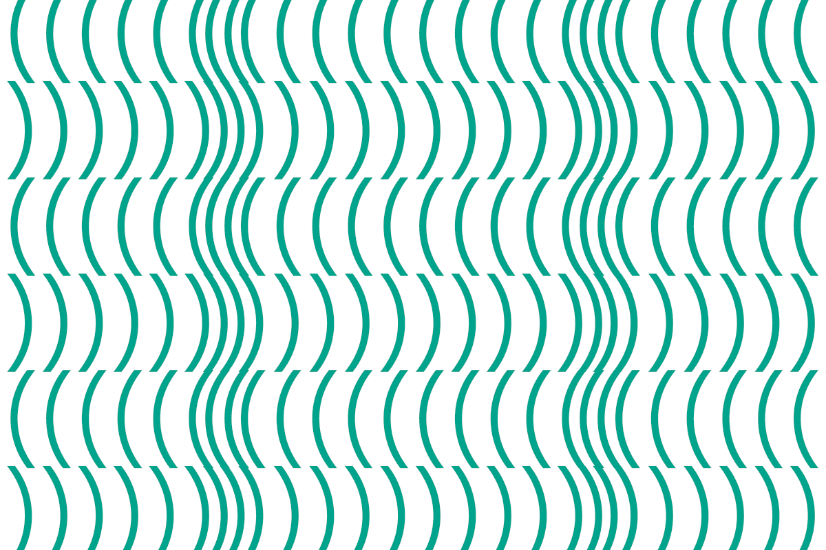
In addition, I designed both some characters and patterns that can be used with layouts. The emoji-style simplified faces are built with the letters and symbols of Acumin Pro typeface. The patterns mostly use less elements each than the characters, but also have color.
Emoji-style character faces built from letters and other typograpic symbols.Sample of some typographical textures.Finnish & Swedish language logos.
I designed a visual identity for Roxeteer Media, a web development company. The yellow color was already in use and looked nice, so the main thing to figure out was the logo. I ended up with a letter R that multiplies into several copies of itself. This represents both the web pages the company makes and the scale of expertise. And it looks quite nice. The number of R's can even vary since the outcome is still very recognizable. The animation is presented here as a GIF, but it's also possible to recreate it with code.
The City of Espoo started a new festival for visual arts in 2019, and asked me to design the visual identity for it. The Espoo Visual Festival was held in mid-September in Träskända mansion and grounds. Featured artworks were mostly light art, video and installation.
The logo consists of three initials of the festival's name. Letterforms are simple and strong and the "depth" of the letter is the same as the line thickness. The letters can morph from one shape to another (below). The outlined version below is meant only for use in very light backgrounds, otherwise the letters have no outlines.
The background of the logo & other elements is a moving landscape of lines reminiscent of neon lights on a dark blue background. For still image use the designer can choose different moments from the background animation for easy variety, and for videos the motion creates a nice sense of space. The lines can also be on top of images.
A motion advertisement for the festival.The lightbox with the logo in the festival grounds.
A fun little typography/lettering job: I was asked to make the logo for Suomalainen kuoronjohtajakilpailu (the Finnish choir conductor competition) and came up with this solution. All letters form a rising shape that can refer to singing. The original letterforms were hand-lettered and subsequently cleaned up a bit (but not too much to maintain some irregularity which I like). Some letters react to each other both horizontally and vertically so the logo is quite lively. The event poster I also designed is below.