Elokuvaharrastus -logo
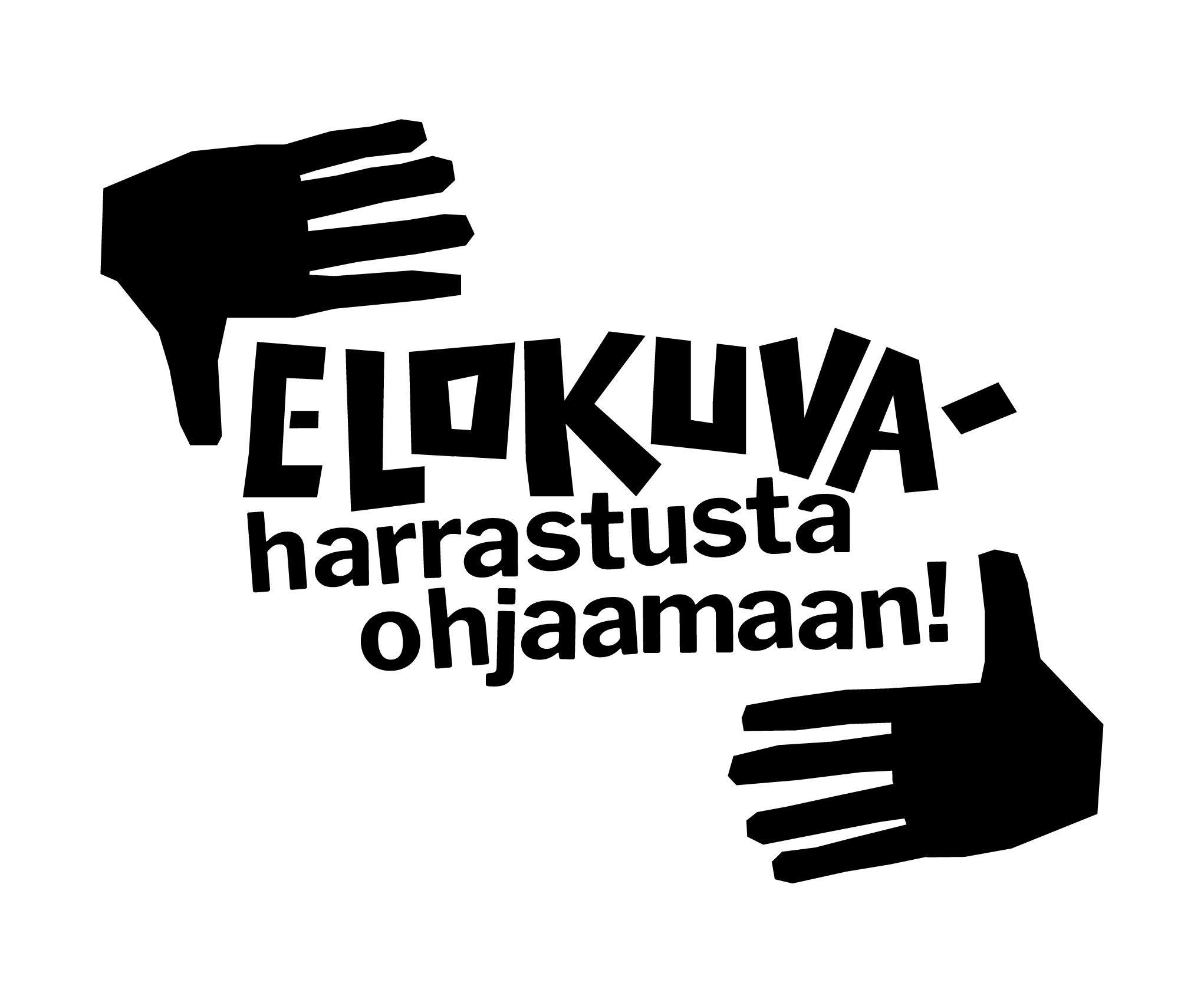
An animated logo for Elokuvaharrastus -project (cinema as a hobby) by Koulukino. The project provides tools for making movies for young people. The logo & colors are inspired by older film titles & posters and specifically by the work of Saul Bass. Main typography is hand-made and the other part of the text is adjusted by hand and each letter individually animated.
Spam Alphabet
Some years ago, curator Jens-Maier Rothe invited me to take part in The One Minutes Foundation’s group video exhibition with the theme of spamming.
As I researched the subject, I noticed that the spam emails use a wide variety of letters that superficially look like the common Latin alphabet, but are actually separate letters from many different languages. I decided to document as many of these letters as possible in the video. I found 97 different ones, though the video only has 93. Some are only used in very obscure languages, so the research was quite interesting.
The natural format for this seemed to be a news broadcast, since many spam emails of the time used a similar dramatic language. All of the scrolling texts (and the channel name) in the video are taken directly from spam emails. The letters are shown one by one with the actual information about them at their side. The background is a stock film showing the making of the meat product that gave spam its name.
My current spam folder contents didn't seem to use the same technique to subvert the reader anymore, the algorithms probably have made it obsolete. So, the video also works as a snapshot to a moment in the history of spam.
Kato luontoon -book design
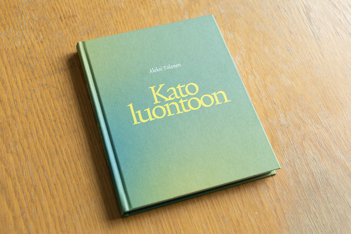
Kato luontoon - book by Aleksi Tolonen (artworks) and various writers. The process of making the book was opposite in some way compared to usual books. Images of Aleksi’s works were sent to the writers, each of whom chose one (or several in some cases) and wrote a text based on the visuals. The writers range from screenwriters to poets and the texts range from essays to poetry. The book was edited by Mikko Rimminen.
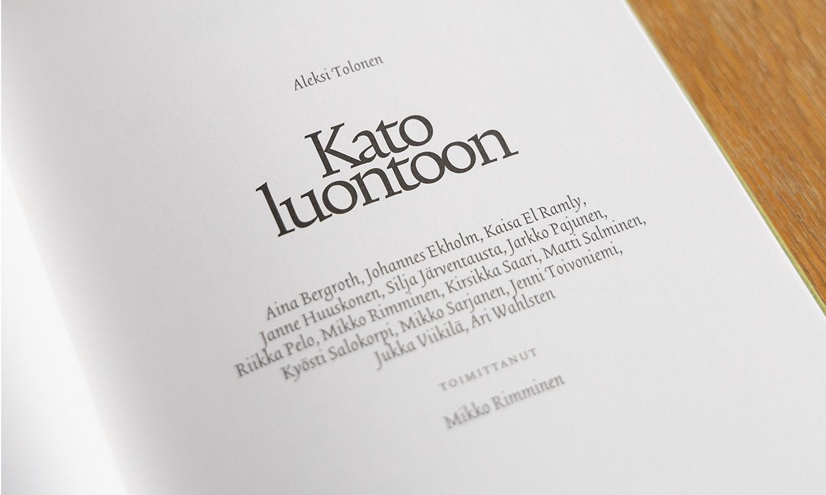
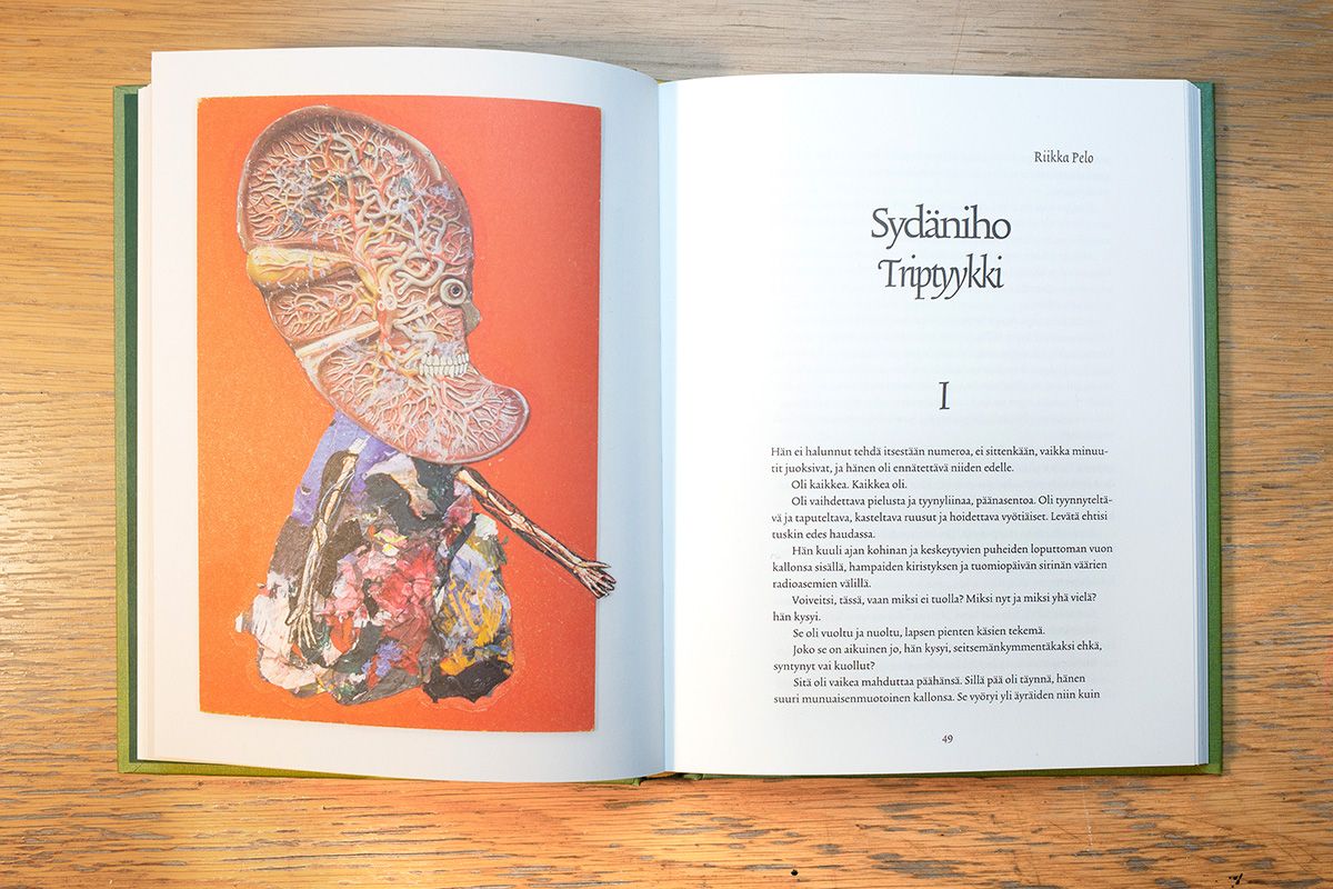
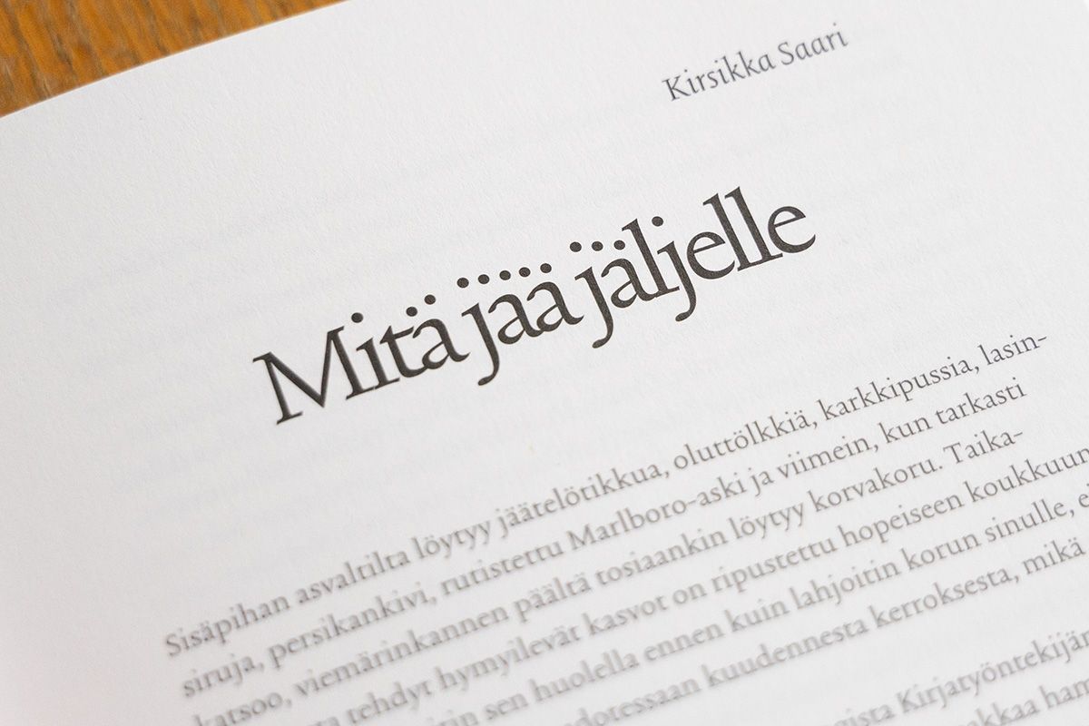
I used Trinité from The Enschede Font Foundry in all texts. Aleksi's imagery is often quite disturbing but at the same time humorous, so I tried to get some of the same mood in the typography. Tight headlines work well and are still readable. I also moved the dots on some headlines, fortunately Finnish language has a lot of them so the effect might even be noticable.
Uudet lukutaidot
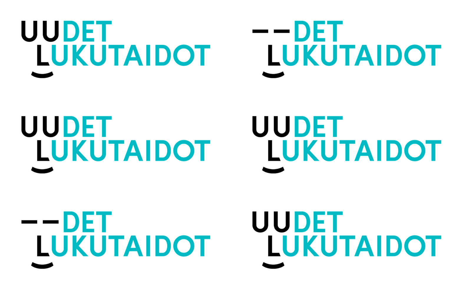
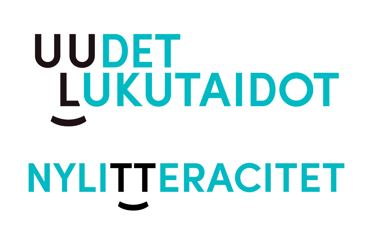
I designed a small visual identity for KAVI's (National Audiovisual Institute of Finland) development program called Uudet lukutaidot (New Literacies). Since the program was about literacy, it made sense to use a typography-based identity elements as well.
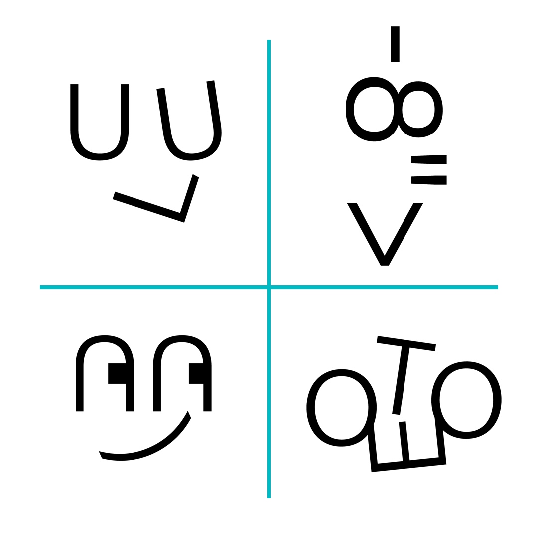
After some preliminary sketches I realized that there is a face to be found in Uudet lukutaidot -text and also the Swedish version (English version was not needed). I emphasized the face by adding a mouth (also with a typographical element, and also did an animated version.
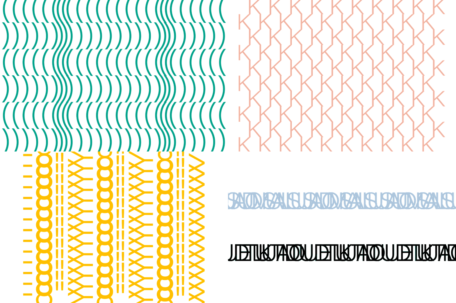
In addition, I designed both some characters and patterns that can be used with layouts. The emoji-style simplified faces are built with the letters and symbols of Acumin Pro typeface. The patterns mostly use less elements each than the characters, but also have color.