Tero Juuti

Miscellaneous Work

Kato luontoon -book design

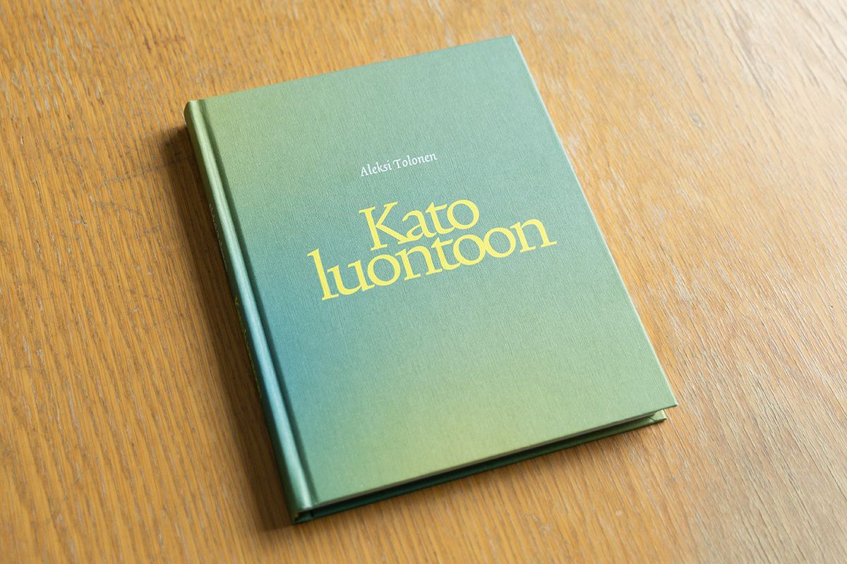
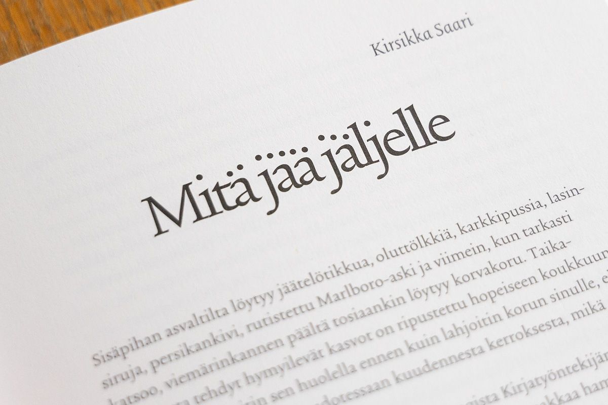
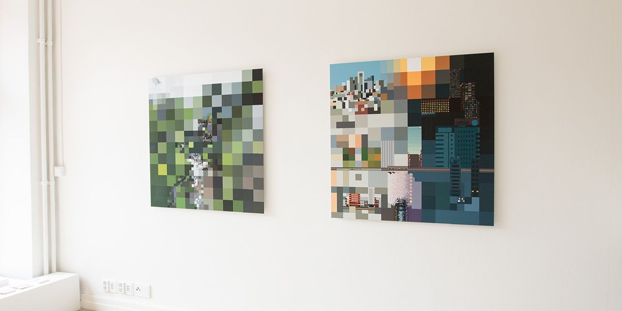
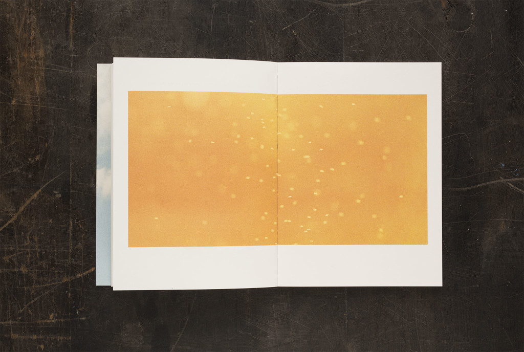
Kato luontoon - book by Aleksi Tolonen (artworks) and various writers. The process of making the book was opposite in some way compared to usual books. Images of Aleksi’s works were sent to the writers, each of whom chose one (or several in some cases) and wrote a text based on the visuals. The writers range from screenwriters to poets and the texts range from essays to poetry. The book was edited by Mikko Rimminen.

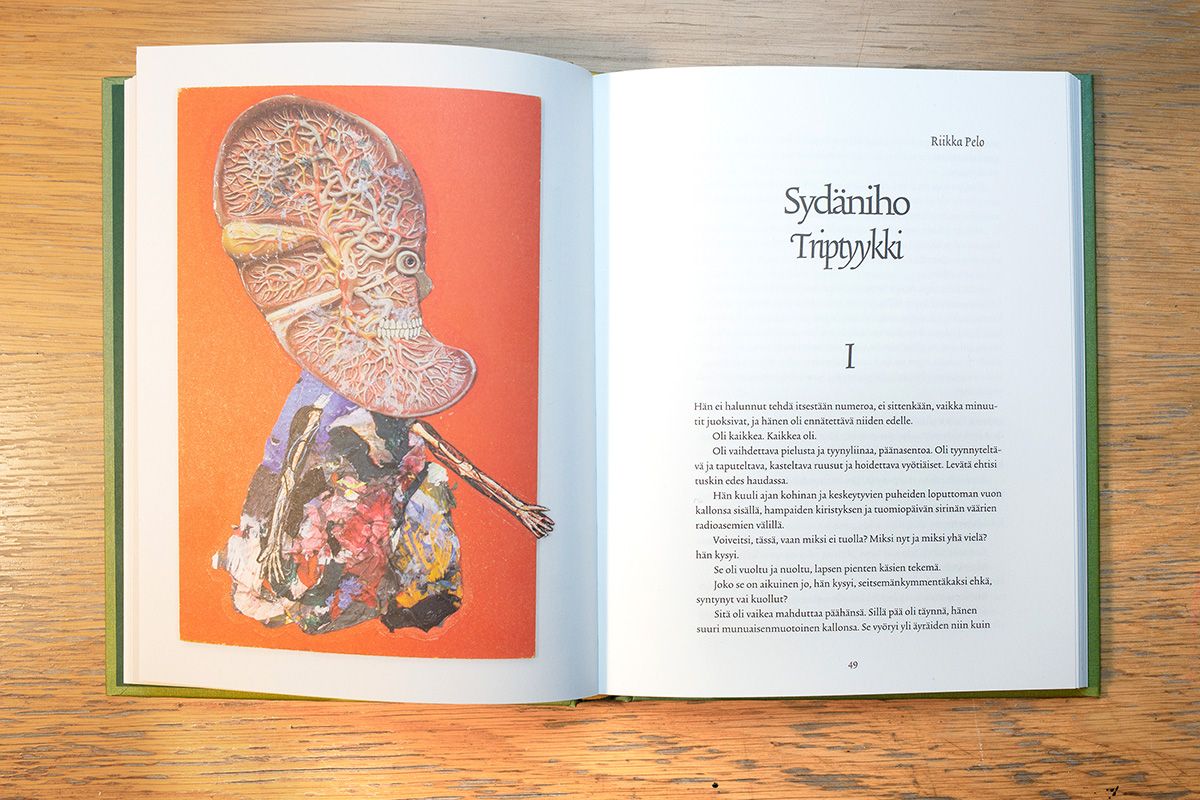
I used Trinité from The Enschede Font Foundry in all texts. Aleksi's imagery is often quite disturbing but at the same time humorous, so I tried to get some of the same mood in the typography. Tight headlines work well and are still readable. I also moved the dots on some headlines, fortunately Finnish language has a lot of them so the effect might even be noticable.

Focus – experimental pixel graphic exhibition

My first private exhibition was on April 2019 in Galleria Kuvitus (The Finnish Illustration Association‘s members’ gallery) in Helsinki. I wanted to experiment with varying pixel sizes (and therefore the viewing distance), so the main works were three 1 x 1 meter prints of Kallio (a neighborhood in Helsinki), Taroko National Park in Taiwan and Tokyo, Japan. The prints were started as 12 x 12 pixel images, and then continued with smaller and smaller pixel size in parts of the image, until the smallest details were just barely visible as pixels in the final prints.

Since the idea of the works was to play with the viewing distances, it’s a challenge to present them in other forms than the original prints. Video works decently, so here’s an animated version showing each work with a zoom to/from a selected detail.

The works looked like this on the gallery itself.

The fourth work is a collection of 16 pixelated images from different places, some having to do with the large prints and some unrelated. They were also arranged to a square form. The smaller works were made in a single pixel size each. Animation about the smaller works is below.

The works were a lot of fun to make and show, and the idea worked quite well, in some places even better than I had hoped. Quite many people showed up too, which is always nice. Thanks again to all the visitors!

Pacifist Biathlonist motion illustration

An old style pixel animation illustration for an article about whether it would be possible to win in Biathlon if one was a pacifist and refused to shoot a gun. The article is only in Finnish but I still won’t spoil the outcome. The illustration was inspired by the C64 classic Winter Games. I made short loops in pixel graphics so the files were pretty light and smoothly running, even if the pixel size was quite large. In addition to the animated loops I made some stills featuring the same character.

Book of Hours

BookOfHours-kansiversiot

Book of Hours is a book by photographer Ida Pimenoff with her photography and writing. I’ve known Ida for a long time, and was very happy she asked me to design the book with her. The form of the book was changing along the process but finally turned out to be quite close to an idea we spoke of early in the making of the book; a notebook with a feeling of everyday.

There are two different covers, both are shots of the same cloud taken moments apart, so the impression is similar but not identical. There are folds in both front and back covers there the cover image continues. The paper is Lessebo Design, which feels very nice and smooth in the fingers.

The book is bound with swiss binding, so the spreads open (almost) completely. The images can be seen completely and the fold doesn’t hide them.

BookOfHours-aukeamakuvia 2BookOfHours-aukeamakuvia 6BookOfHours-aukeamakuvia 8

Many of the images are shot in panoramic format so the book shape was built around them, with some flexibility for other formats. At times the editing of the book felt a lot like editing a film because of the cinema-like quality of many shots.

BookOfHours-aukeamakuvia 3BookOfHours-aukeama tekstilläBookOfHours-aukeamakuvia 4

With smaller images and texts I paid a lot of attention to the interplay of the elements within the spreads and also from one spread to the next.

The only typeface used in the book is Minion Pro, a common font that is nevertheless very well done and quite friendly and familiar in appearance. The typeface is designed with different versions for different text sizes, many of which were in use in the texts.

Book of Hours, like Ida’s earlier books, was published by Kehrer Verlag. Here’s a flip-through video of the book.

Writings by Maija

Maijazine-kansi

-…………0+ is a self-published collection of writings by Maija. I edited and designed the zine from a larger collection of writings originally published in Maija’s Facebook page. The text is very abstract, so while designing the layout I was mostly working to make the text appear visually interesting instead of a conventional layout process.

Maijazine-kooste-2K-aukeama1
Maijazine-kooste-2K-aukeama3
Maijazine-kooste-2K-aukeama5
Maijazine-kooste-2K-aukeama10
Maijazine-kooste-2K-aukeama11
Maijazine-kooste-800px