An animated logo for Elokuvaharrastus -project (cinema as a hobby) by Koulukino. The project provides tools for making movies for young people. The logo & colors are inspired by older film titles & posters and specifically by the work of Saul Bass. Main typography is hand-made and the other part of the text is adjusted by hand and each letter individually animated.
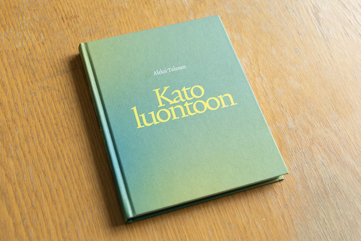
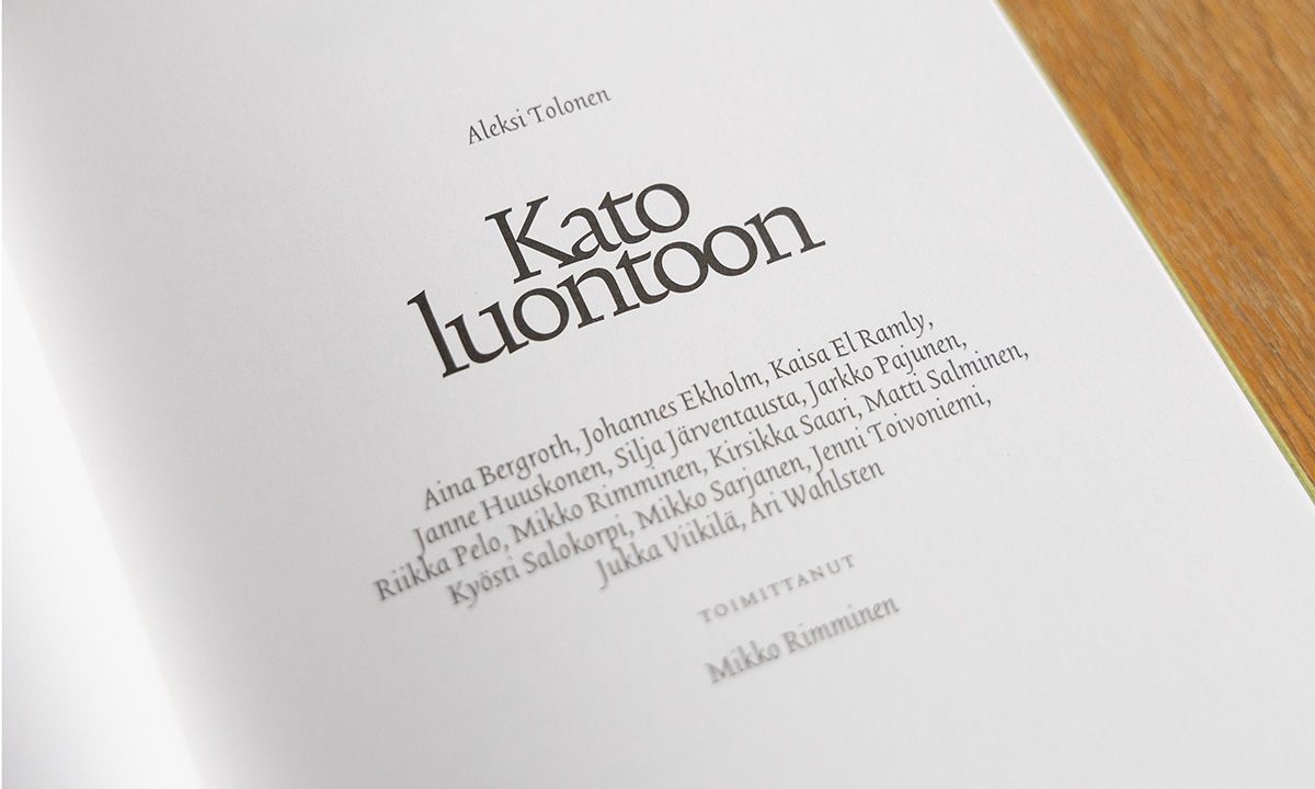
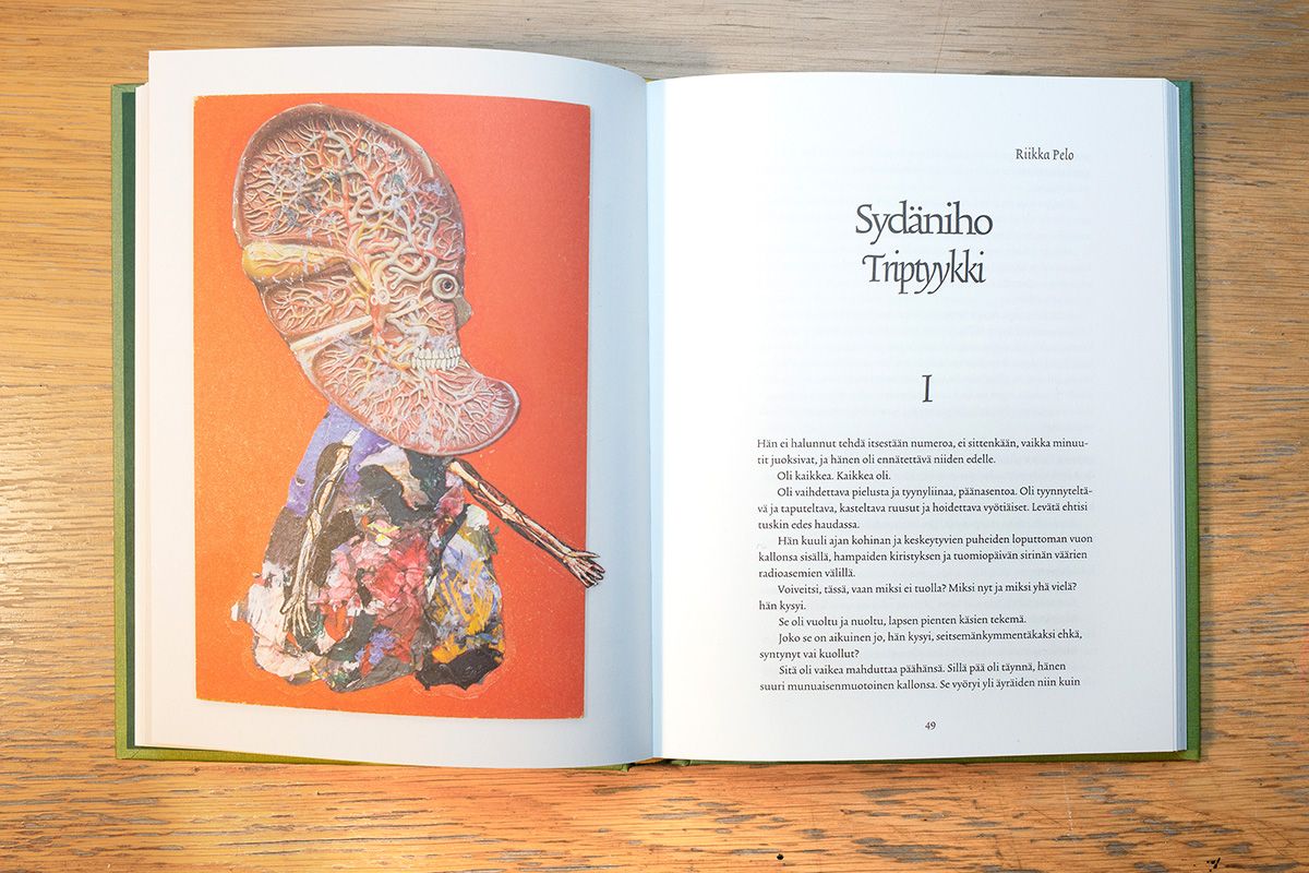
Kato luontoon - book by Aleksi Tolonen (artworks) and various writers. The process of making the book was opposite in some way compared to usual books. Images of Aleksi’s works were sent to the writers, each of whom chose one (or several in some cases) and wrote a text based on the visuals. The writers range from screenwriters to poets and the texts range from essays to poetry. The book was edited by Mikko Rimminen.
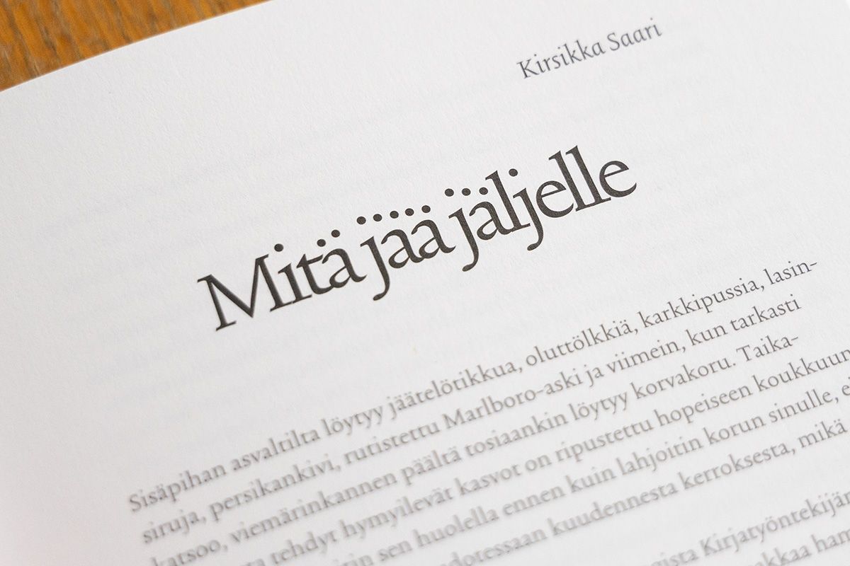
I used Trinité from The Enschede Font Foundry in all texts. Aleksi's imagery is often quite disturbing but at the same time humorous, so I tried to get some of the same mood in the typography. Tight headlines work well and are still readable. I also moved the dots on some headlines, fortunately Finnish language has a lot of them so the effect might even be noticable.
Donna is a 10-episode Finnish romantic comedy TV series starring Alina Tomnikov. I made the graphic identity for the series including title sequence and other elements.
The main character of the series is blind, so this was an important element to convey visually somehow. Of course black screen could have been a bit too minimalistic, so I thought of using hand-drawn circles as a graphic element. They look like the bokeh of camera lens (the circles light sources make when they are out of focus) and the vibration hand-drawn ones were making looked quite nice. There are some in the background in the title sequence, and another example is below.
Of course there needs to be text too, and since the hand-drawn look seemed to work on the circles I decided to use a similar approach on the texts. The hand-drawn title seems a bit light when seen in a still form but works well in motion (below) and of course when composed over images. The drawing was done frame-by-frame in Photoshop, with only the previous frame as the guide. This resulted in a small drift of the letters which is nicely lively.
I did test the actors’ names with the same technique too, but that turned out to be a bit too hectic effect when combined with images. However, I can obviously post them here as a small bonus feature.
The title sequence above is not the final one but almost, colors were fine-tuned by the post-production company. You can check out the series in Yle Areena (might only work in Finland though) and the crew & other info in IMDb.
A fun little typography/lettering job: I was asked to make the logo for Suomalainen kuoronjohtajakilpailu (the Finnish choir conductor competition) and came up with this solution. All letters form a rising shape that can refer to singing. The original letterforms were hand-lettered and subsequently cleaned up a bit (but not too much to maintain some irregularity which I like). Some letters react to each other both horizontally and vertically so the logo is quite lively. The event poster I also designed is below.
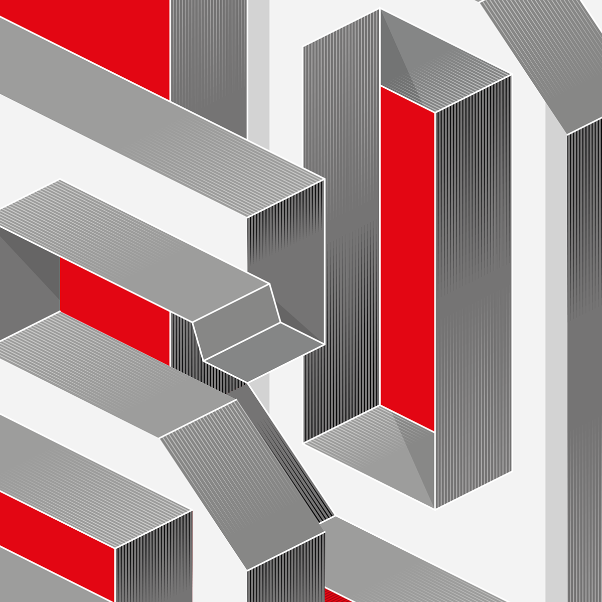
Talouselämä is one of the major economy magazines in Finland. They publish an annual Top 500 companies in Finland -issue and wanted me to design the number 500 for this year’s cover.
After some sketching we decided to go for the isometric perspective look. The text “500” itself isn’t typographically the most interesting, since two out of three numbers are the same, but the “extra dimension” in the perspective gave it some more possibilities. I made some cubes and piled them up for the basic forms, which were then refined further. After the forms were for the most part ready I added some details in “impossible perspective”, so the letters could be seen as from two different viewpoints. It’s a small detail but a nice added bonus, if someone spots it. The red color is the main color of the magazine and the gray tones are also used frequently.
Detail with shading lines and changing perspective.